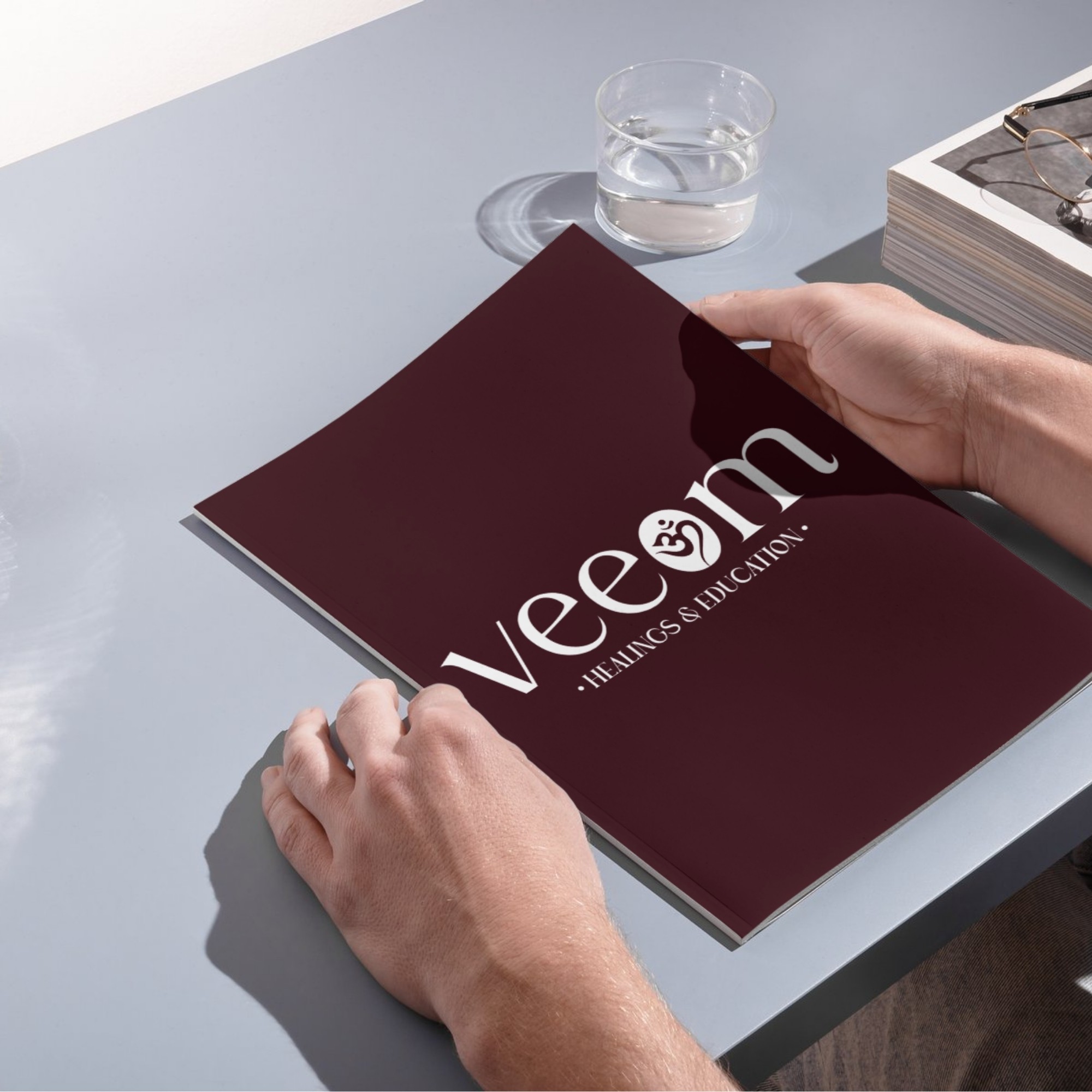
Veeom Healing Centre
Developed a brand identity rooted in stillness, energy and intuitive healing — visually aligned with the founder’s vision.

Symbol-Led Logo Design
Integrated the ‘Om’ symbol seamlessly into the "O" of Veeom — creating a subtle, meaningful mark that evokes presence and spiritual depth without losing minimalism.
Font & Color Direction
Used the Ramole typeface to bring modern softness and structure to the brand’s name. Paired with a deep maroon tone to reflect calm energy, balance, and emotional clarity.
Soul-Aligned Branding
The final identity feels grounded yet elevated — helping Veeom communicate healing, trust, and intention at every visual touchpoint.